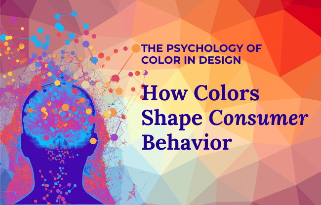
In web design, color isn’t just about aesthetics; it’s a psychological tool that can guide user behavior, set the tone for your brand, and even impact conversions. Does that sound manipulative? Sure. Major brands understand how to use color to guide consumers, and you should too. Let’s delve into the psychology of color.
The Science Behind Color Psychology
Color affects our emotions and decision-making in ways we don’t always realize. Research shows that up to 90% of a consumer’s first impression is based on color alone! That means the right color scheme on your website can keep visitors engaged—or drive them away.
Here’s a quick exploration of how different colors influence perception:
- 💙 Blue: Trust, stability, professionalism (Think: Facebook, PayPal, LinkedIn)
- ❤️ Red: Urgency, excitement, passion (Sales banners, YouTube, Coca-Cola)
- 💚 Green: Growth, health, relaxation (Whole Foods, Spotify)
- 💛 Yellow: Optimism, energy, attention-grabbing (McDonald’s, Snapchat)
- 🖤 Black: Luxury, sophistication, authority (Chanel, Nike, Apple)
- 💜 Purple: Creativity, royalty, mystery (Twitch, Hallmark, Yahoo)
- 🤍 White: Simplicity, cleanliness, minimalism (Apple, Tesla, high-end brands)
- 🧡 Orange: Friendliness, enthusiasm, action (Amazon, Fanta, Nickelodeon)

How to Use Color Strategically in Brand Design
1. Understanding the Psychology of Color
- Color and Emotions: Delve into the emotional associations of different colors (e.g., red evokes excitement, blue conveys trust) and how these impact brand perception.
- Cultural Considerations: Explore how color symbolism varies across cultures and the importance of adapting color choices for diverse audiences.
- Color and Target Audience: Analyze how color can be used to appeal to specific demographics and psychographics (e.g., bright colors for a younger audience, muted tones for a more mature audience).
2. Creating a Cohesive Brand Color Palette
- Primary and Secondary Colors: Discuss the selection of a dominant brand color and complementary secondary colors that support the brand’s message.
- Color Harmony: Explain the principles of color harmony (e.g., analogous, complementary, triadic) and how to apply them for a visually appealing and balanced brand identity.
- Color in Different Contexts: Consider how the brand’s colors will be used across various touchpoints (e.g., website, logo, packaging, marketing materials) and ensure consistency.
3. Color in Branding Elements
- Logo Design: Explore how color can be used to enhance the impact and memorability of a brand’s logo.
- Website Design: Discuss the role of color in website design, including its influence on user experience, navigation, and calls to action.
- Packaging Design: Analyze how color can be used to differentiate a brand’s products on the shelf and communicate product attributes.
- Marketing Materials: Consider how color can be used in advertising, social media, and other marketing materials to capture attention and convey the brand’s message.
4. Evolving Brand Color
- Trends and Adaptability: Discuss the importance of staying current with color trends while maintaining a timeless brand identity.
- Rebranding and Color: Explore how color can be used strategically during a rebranding effort to signal change and evolution.
- Seasonal Color Variations: Consider using color variations to align with seasons, holidays, or special promotions while maintaining brand consistency.
- Your Brand’s Personality:
This is where the magic truly happens. Your brand isn’t just a logo or a catchy slogan; it’s a personality, a feeling, an experience. And color plays a pivotal role in shaping that personality.- Vibrant and Energetic: If your brand is all about youthfulness, excitement, and movement, think bold and bright colors. Reds, oranges, and yellows can evoke feelings of energy and enthusiasm.
- Calm and Trustworthy: If your brand aims to convey stability, trust, and reliability, cooler colors are your go-to. Blues, greens, and even some purples can create a sense of calmness and security.
- Sophisticated and Luxurious: For brands that want to exude elegance, sophistication, and exclusivity, deeper and richer colors often hit the mark. Think deep blacks, rich purples, and even metallics like gold and silver.
- Natural and Earthy: If your brand is connected to nature, sustainability, or health and wellness, earthy tones are a natural fit. Browns, greens, and even some yellows can create a sense of grounding and connection to the natural world.
Remember, color psychology isn’t an exact science. It’s about understanding the general feelings and associations that colors evoke and using that knowledge to create a brand personality that resonates with your target audience.
5. Measuring the Impact of Color
- A/B Testing: Explain how A/B testing can be used to measure the effectiveness of different color choices in driving desired outcomes (e.g., click-through rates, conversions).
- User Feedback: Discuss the value of gathering user feedback on color preferences and perceptions to inform brand color decisions.
- Brand Tracking: Monitor how color choices impact brand awareness, recall, and overall brand sentiment over time.
Color Palette Examples:


How to Use Color Strategically in Web Design
- Use Your Brand Style Guide
A brand style guide is a document that outlines how a brand presents itself, ensuring consistency in visual elements like logos, fonts, colors, and imagery, as well as verbal communication and tone. If you don’t have one, you should! - Use Contrast for Readability & Engagement
Ever struggled to read neon green text on a bright yellow background? (Ouch! My eyes!). Contrast is key for accessibility and user experience. Dark text on a light background—or vice versa—ensures readability and keeps visitors on your page longer. - Leverage Color for Calls to Action (CTAs)
Your “Buy Now” or “Sign Up” button shouldn’t blend in like a shy introvert at a networking event. Use bold, attention-grabbing colors (like red or orange) to draw the eye and encourage clicks. - Consider Cultural and Emotional Associations
Colors don’t mean the same thing everywhere. While white symbolizes purity in Western cultures, it’s associated with mourning in some Asian cultures. If your website has a global audience, make sure your color choices resonate appropriately.
The Takeaway: Color is More Than Just Decoration
Your website’s color scheme isn’t just about looking pretty—it’s a psychological powerhouse that shapes how users feel about your brand, and even how they trust and interact with your brand. Choose wisely, test different palettes, and use color to guide visitors toward action.
